Best Collage Layouts for Instagram in 2026: What Actually Performs
Published on
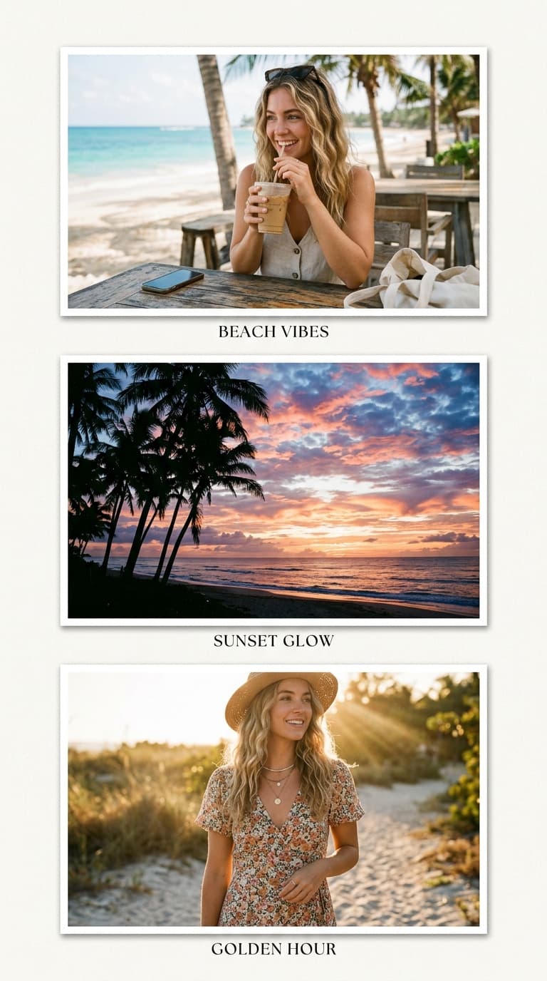
Best Collage Layouts for Instagram: What Actually Performs
Instagram renders your collage in three different places — the feed, the profile grid, and Stories — and each one crops differently. The "best" layout is therefore not a matter of taste but of destination. Here is what works where, based on how the platform actually displays images.
For feed posts: 2×2 and magazine splits win
The feed rewards clarity. A 2×2 grid at square resolution displays edge-to-edge with every quadrant legible, which is why before/after transformations and couple announcements perform so well in this format.
When you have one unmissable frame, the Big+3 style split gives it half the canvas while three smaller cells add context. This mirrors what editorial accounts do for event coverage: hero image plus supporting details. Five cells is the practical ceiling here — beyond that, faces shrink below thumbnail legibility in busy feeds.
For carousels: overview collage first, singles after
Carousels let you have it both ways. Lead with a 3×3 overview collage as slide one, then follow with individual photos as subsequent slides. Viewers who swipe get full-resolution versions of exactly the frames that caught their eye, and the algorithm counts every swipe as engagement.
Practical setup: compose the overview once, keep all photos loaded in the editor session, then export singles separately from the same pool.
For Stories and Reels covers: go vertical or go home
Stories fill the phone screen vertically. A square collage letterboxes with dead space above and below; a 9:16 vertical stack owns the entire viewport instead. Three stacked frames with thin gaps reads as one flowing column — ideal for outfit sequences or step-by-step content.
Reels covers crop to roughly 9:16 in profile view, so build covers on the story canvas and keep text within the middle 80% — the interface overlays trim edges aggressively.
Layout picks by content type
- Travel recaps: 3×3 grid, chronological, one landmark anchoring centre
- Food pages: horizontal strip showing prep → cook → plate
- Fashion: vertical stack, accessories to full-length
- Event announcements: Big+2 split, key visual dominant, details flanking
- Before/after niches: strict 2×2, identical crop distance both sides
The compression reality
Instagram recompresses every upload regardless of source quality. Exports that start clean survive this best: use PNG rather than JPEG when the collage carries fine detail or small text, and apply contrast slightly above what looks natural in preview — compression flattens tonal range, so starting bold ends balanced.
One more habit worth stealing from designers: check the profile-grid crop before posting. The grid shows only the centre square of portrait and wide images. If your composition's meaning lives in an edge, recentre it or accept that grid viewers will see a teaser rather than the whole story.
Pick the layout for the destination, export clean, and the format stops working against you.
Create your collage now
Launch the free tool and turn your photos into a polished collage in under two minutes.
Open Collage Maker